
Rebranding a city isn't something you do every day — and this one came with the full experience: a live City Council presentation, streamed to the community of Rogers, Minnesota, and a fresh identity that helped residents see themselves in a new way.
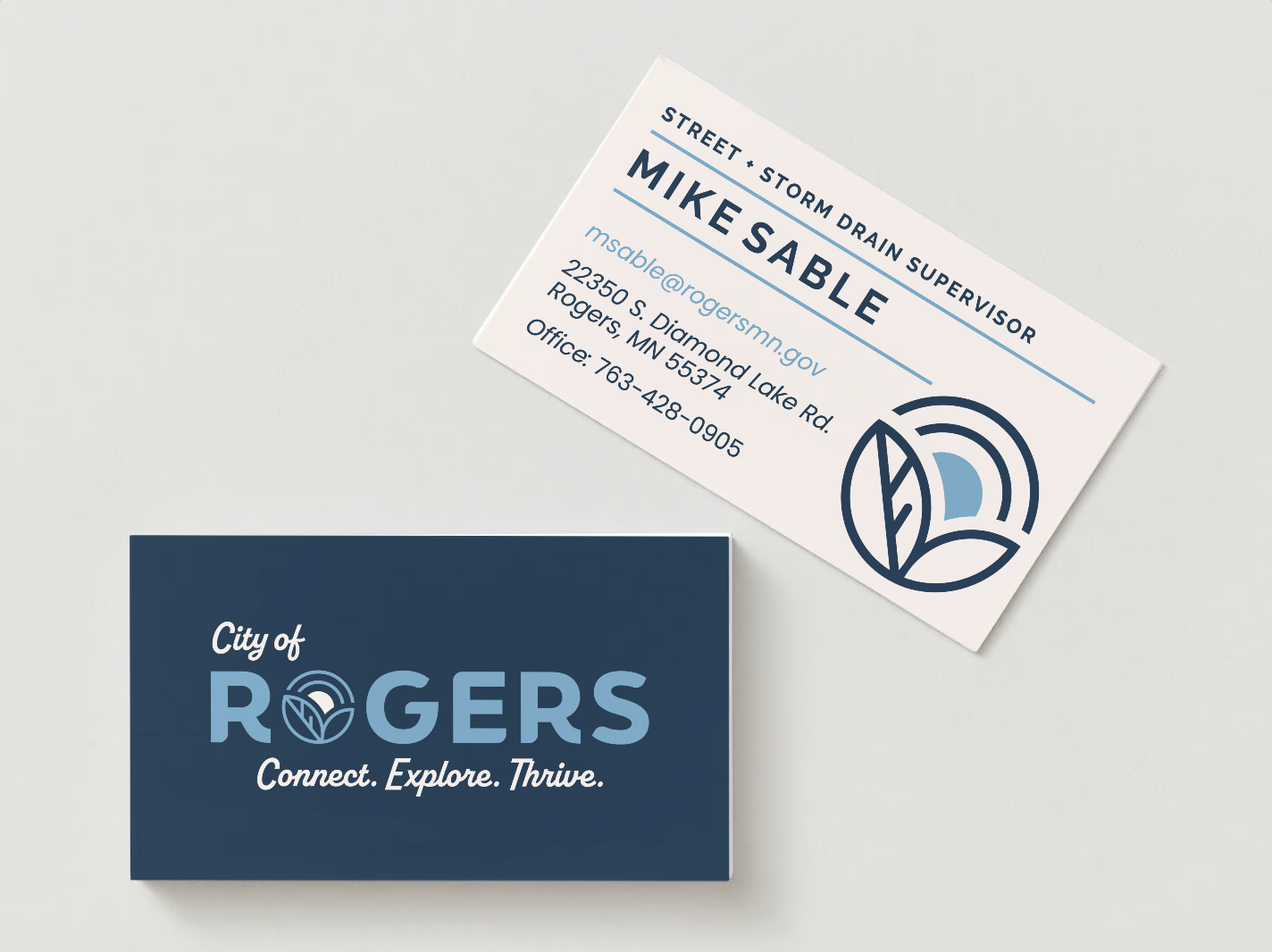
The new logo centers on a custom mark — a rising sun over leaves shaped into rolling hills — symbolizing vitality, community, and forward momentum. Bold, geometric typography brings clarity and strength, while a nostalgic script tagline, 'Connect. Explore. Thrive.' adds energy and a touch of Midwest charm.
Design Shop MPLS began with a full brand audit and competitive review, digging into Rogers' values, history, and vision for growth. The result is a well-rounded identity system designed to work at any scale — from city signage to department extensions to digital touchpoints — reflecting a place that's proud of where it's been and ready for what's next.
City of Rogers Rebrand: A Fresh Identity for a Growing Community
KATE CARLSON
+ Brand Foundation
+ Brand Identity
+ Collateral Design
+ Department Extensions
Original Logo

New Logo